Digby writes about the NYT census/google map and what it helps reveal about the Versailles elite and the rest of us:
Click on the two maps and you will see that average Americans are living very differently than the beltway celebrity millionaires and realistically are as likely to just "go out and get some of that wealth" (as Roger Simon says they should do) as they are to become an Olympic swimmer or a ballerina. Sure, it's possible, but unless you are a really, really great athlete, constructing your future around it doesn't make a whole lot of sense.
I think it's particularly illuminating to look at DC in context, using the map option that displays income change over the past decade. This is the first decade in like, forever that incomes generally went down (not for the top 1%, of course, but for just about everyone else). But this wasn't universally the case, and the geographic distribution is most revealing. Let's start by looking at DC in a broad, more-than-half-of-the-country overview, and then zoom in:
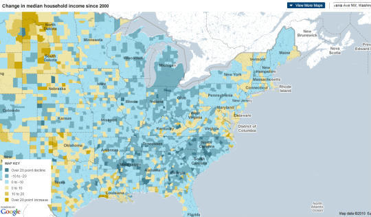
[Click to Enlarge in New Window]
Closer:
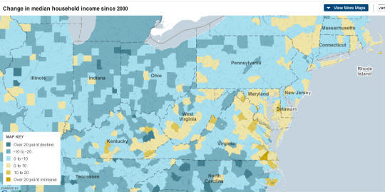
[Click to Enlarge in New Window]
Closer:
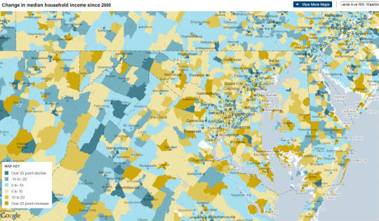
[Click to Enlarge in New Window]
Beltway:
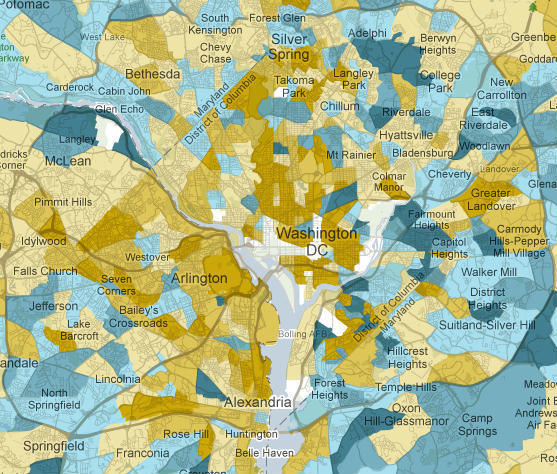
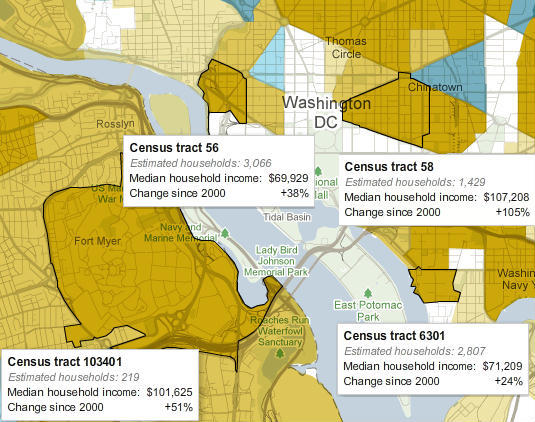
Now let's look at the census tract figures for four census tracts close to the seats of power:
And five more tracts:
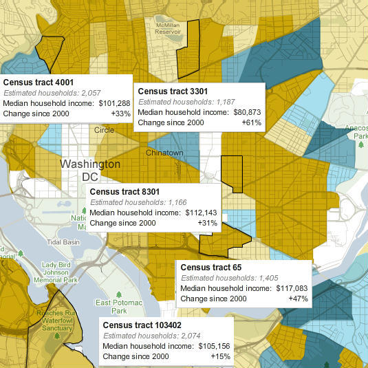
Now, if you lived in this kind of economic environment, how out of touch with average Americans would you be?
Now add on 24/7 corporate propaganda, and more lobbyists per square inch than anywhere in at least 10 light years or so, and, well, you get the picture. There's just no way these people can possibly have a clue... that they don't have a clue.
|

 STATE BLOGS


